02 / Brand Story
The Name
Why "Collier Recovery Organization" and what the crow means.
Can You Crow?
The crow is one of the most intelligent creatures on earth. It remembers faces. It solves problems. It adapts to any environment. It thrives in cities, forests, coastlines. It builds community. It communicates across distances. And it never stops learning.
CRO is not a clinical acronym. It is a crow call. A sound of arrival. A declaration that says: I am here, I made it through, and I am not quiet about it.
The crow carries no shame. It does not hide. It sits on the highest branch and announces itself. That is the spirit of this organization: recovery out loud, in community, without apology.
Collier County Context
Naples and Collier County project affluence and calm on the surface. But underneath, families are navigating addiction, mental health crises, and a system that does not always meet them where they are. CRO exists to fill the gap between clinical treatment and real life, offering the community that makes recovery stick.
This is not a rehab. This is not therapy. This is the ecosystem around recovery: peer support, community events, family education, employment bridges, sober social spaces, and a visible network that says recovery is normal, recovery is happening, and recovery is welcome here.
Founded by Britten Grayden
CRO was founded by Britten Grayden as a 501(c)(3) nonprofit Recovery Community Organization. The vision is rooted in lived experience and a practical understanding of what Collier County needs: not another treatment center, but a recovery infrastructure that holds people once treatment ends.
The organization operates at the community level, serving individuals in recovery, their families, veterans, women and children, and seniors. It is designed to be permanent, visible, and woven into the fabric of the county itself.
03 / Visual Identity
The Mural-Inspired Art Direction
CRO's visual identity is built on the language of murals: public art that belongs to the community, tells stories at scale, and transforms the spaces it inhabits. This is not decoration. This is the visual soul of the brand.
Why Murals?
A mural is public. It is permanent. It changes a wall, a street, a neighborhood. It takes something ordinary and makes it meaningful. That is exactly what CRO does with recovery in Collier County.
The mural aesthetic gives CRO a visual language that is simultaneously artistic and accessible. It carries the energy of street art (bold, alive, unapologetic) and the sophistication of fine art (intentional, layered, beautiful). It speaks to a 25-year-old who follows graffiti artists on Instagram and to a 65-year-old who appreciates craft and permanence.
Three concept murals define this direction. They are not final installations. They are the visual DNA from which every CRO touchpoint draws its identity.
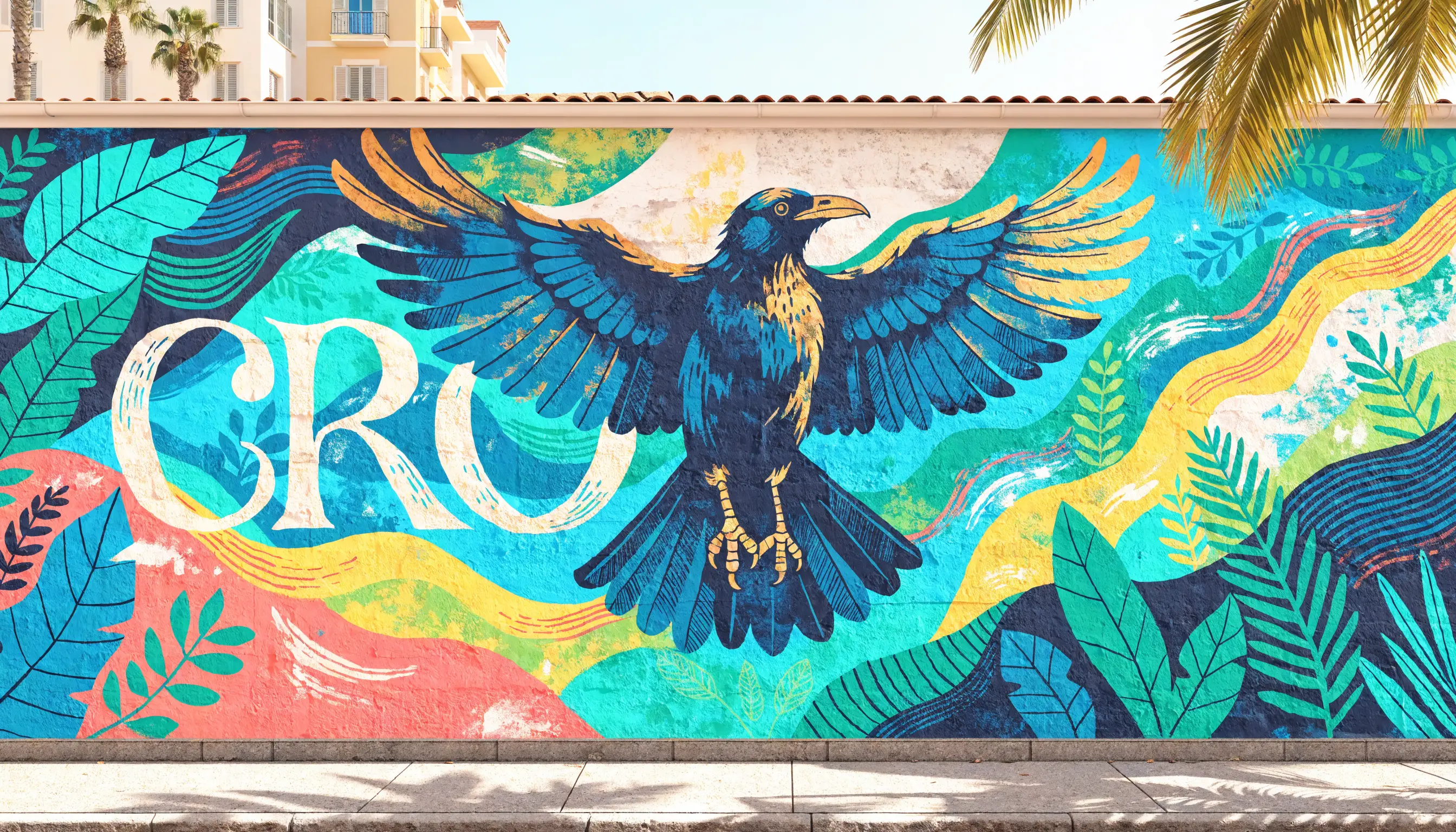
Concept 01 / Exterior Mural
The Street Mural
A large-scale exterior wall mural on a coastal building. A stylized crow in flight with wings spread wide, surrounded by flowing abstract waves and tropical foliage. This concept carries the full energy of the brand: urban street art mixed with elegant fine art, bold brushstrokes layered with spray paint textures, and "CRO" rendered in large artistic lettering. The crow appears in deep navy and teal with gold accent details. This is CRO at its most visible, its most public, its most unapologetic. The mural that makes someone stop their car and ask what CRO is.
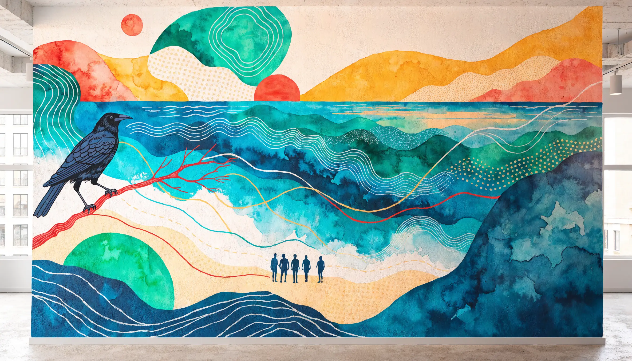
Concept 02 / Interior Mural A
The Community Mural
An indoor wall mural on a white wall inside a modern community center. An abstract landscape where ocean waves meet a sunrise sky, with silhouettes of people standing together on a shoreline and a single crow perched on a branch overhead. Watercolor softness blends with bold graphic shapes and geometric patterns. This is the quieter side of the brand: reflective, warm, grounding. The mural you sit with during a meeting, a conversation, a moment of clarity.
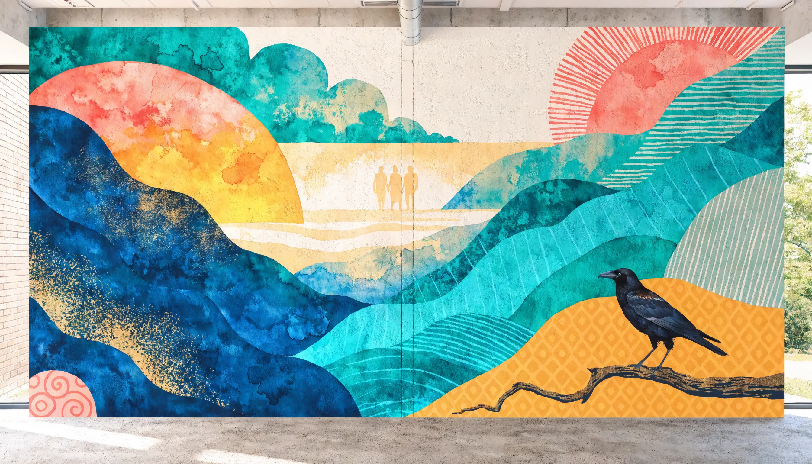
Concept 03 / Interior Mural B
The Community Mural (Variation)
A second interpretation of the interior mural concept, exploring a different compositional approach to the same thematic elements: the shoreline, the gathering, the crow, the sunrise. This variation demonstrates that the visual language is flexible. It is a system, not a single image. Different artists and different contexts can interpret the same brand DNA and produce something that feels distinctly CRO every time.
Watercolor Meets Street Art
The core visual tension of CRO lives between two painting traditions. Watercolor brings softness, transparency, and organic flow. Street art brings boldness, scale, and unapologetic presence. Every visual touchpoint should feel like it lives somewhere on this spectrum. A social media post might lean more street art. A donor brochure might lean more watercolor. But both traditions are always present in the DNA.
The Crow as Living Symbol
The crow is not just a logo mark. It is a recurring character in the visual world of CRO. It appears in murals, as a watercolor accent, as a stencil element, as a subtle pattern. It can be realistic or abstracted, detailed or silhouetted. The only rule: it should always feel alive, in motion, or watchful. Never static, never decorative, never cartoonish.
Ocean, Shoreline, Horizon
The Collier County geography is baked into the visual language. Waves, shorelines, horizons, and tropical foliage are not clip art additions. They are integral to the mural aesthetic. The ocean represents the journey. The shoreline represents the present moment. The horizon represents what is possible. These elements can appear as full illustrations, as subtle background textures, or as abstract color gradients.
Texture Over Flatness
CRO visuals should never feel like they were made in a corporate design tool. The mural aesthetic demands texture: brushstroke marks, watercolor bleeds, spray paint grain, canvas weave, ink splatter. In digital contexts, this means using textured overlays, hand-drawn elements, and organic shapes rather than perfect vectors and hard edges. The brand should feel made by hands, not by software.
How the Murals Extend Across Touchpoints
The mural concepts are not standalone art pieces. They are a visual vocabulary. Individual elements can be extracted and reused: a wing fragment as a background texture, a wave pattern as a section divider, a sunrise gradient as a header treatment, a crow silhouette as a watermark. The full mural compositions appear in physical spaces and hero moments. The fragments appear everywhere else.
This layered approach means the brand can scale from a business card to a building wall and feel consistent at every size. The system is modular by design.
05 / Color Palette
Color System
Eight colors extracted directly from the exterior wingspread mural and refined into a working system. Every color has a role in the mural composition and a function in the brand's daily visual language.
Primary
Deep Ocean
#2D4766
Headlines, headers, primary text, dark backgrounds. The anchor of authority and depth.
In the mural: the deep blue of the crow's body, the ocean center, the night sky behind the wingspan.
Primary
Ocean Teal
#397992
Core brand color. Buttons, links, key accents. The middle depth of the ocean.
In the mural: the mid-range ocean tones surrounding the crow, where deep water meets the reef.
Accent
Turquoise
#29DFDB
Youth energy. Hover states, badges, highlights, indicators. The spark. Use with intention.
In the mural: the brightest turquoise in the wings, the electric spray paint energy, the shallow water catching light.
Neutral
Warm Sand
#F3DEC9
Backgrounds, sections. Warmth and comfort without clinical white. Safe ground.
In the mural: the wall surface showing through, the sandy beach tones, the warm negative space.
Accent
Golden Sand
#E7C498
Section accents, borders, feature highlights. Warm and approachable across demographics.
In the mural: the golden light at the edges, the sunset warmth, the sandy ground tones meeting the water.
Accent
Terracotta
#CA998D
Humanity, warmth, callouts. Use for emotional moments and grounding accents. Never dominant.
In the mural: the coral and clay tones in the lower composition, the earth meeting the sea.
Accent
Sage
#B3D2A8
Growth, nature, organic elements. Secondary backgrounds, nature-aligned content.
In the mural: the tropical foliage and organic greens woven through the composition.
Neutral
Taupe
#A89984
Muted text, borders, subtle dividers. The quiet neutral that ties warm and cool tones together.
In the mural: the stone and driftwood tones, the aged wall surface, the transition between sand and sea.
Usage Rules
- Deep Ocean and Ocean Teal carry 80% of the visual weight
- Warm Sand is the default background, not white
- Turquoise is for digital-first moments: hover states, badges, indicators
- Golden Sand and Taupe anchor section dividers, borders, and feature accents
- Sage pairs naturally with Warm Sand for organic, nature-forward sections
- Never use Turquoise as a background color
- Never pair Terracotta and Turquoise directly without Ocean between them
- Never use pure white (#FFFFFF) as a page background
- Never use more than two accent colors in a single component
The Mural Palette in Practice
The six brand colors are not arbitrary selections from a color theory exercise. They are extracted directly from the mural compositions. Deep Navy is the crow. Recovery Teal is the water and foliage. Warm Sand is the shore and the wall. Electric Teal is the spray paint energy. Gold is the sunrise. Coral is the dawn sky. When someone asks "why these colors," the answer is in the murals. The palette is grounded in a story, not a mood board.
09 / Imagery & Art Direction
Visual Content Guidelines
The mural aesthetic redefines how CRO approaches all visual content. Photography, illustration, texture, and the crow motif each play a specific role in the visual ecosystem.
The Crow as Brand Character
The crow is not a static logo element. It is a living character that appears across the brand in multiple forms: a full mural illustration with wings spread wide, a watercolor silhouette hovering over a section header, a stencil-style mark on a t-shirt, a subtle texture embedded in a background pattern. The crow can be rendered in any style that falls within the mural aesthetic spectrum, from photorealistic to fully abstracted.
The crow always conveys: intelligence, resilience, community, and presence. It is always active, never passive. Perched and watchful is acceptable. Stuffed and mounted is not.
Crow in Flight
Wings spread, moving forward. Use for hero moments, launch announcements, and outward-facing brand expressions. This is CRO at full volume. The exterior mural captures this energy perfectly.
Crow Perched
Still, watchful, grounded. Use for interior spaces, reflective content, support-focused communications. This is CRO holding space. The interior murals capture this tone.
Crow Abstracted
A wing fragment, a feather texture, a silhouette dissolved into brushstrokes. Use as background elements, watermarks, section dividers, and subtle brand signals in everyday communications.
Mural-Style Illustrations
The primary visual category. Commissioned or generated artwork that follows the mural aesthetic: watercolor textures, bold brushstrokes, organic forms, ocean and shoreline motifs, tropical foliage, and the crow. Use as hero images, section backgrounds, event graphics, and environmental installations.
Watercolor Textures
Extracted from the mural language and used as background elements in digital and print. Soft washes of brand colors, bleeding edges, organic gradients. These replace the flat color blocks and hard-edged sections found in generic nonprofit design. Never so heavy that they interfere with content readability.
Street Art Energy
Spray paint grain, stencil effects, bold letterforms, layered textures. Use in social media content, event posters, and youth-facing communications. This is where the brand connects most directly with the 20-to-40 audience. Keep it intentional, not chaotic.
Photography: Real Moments
Candid over posed. Movement over stillness. Laughter, conversation, cooking, walking, building. The moments between the milestones. Never staged group therapy circles or hands-clasped-in-prayer shots. Photography should feel like a documentary, not a stock photo library.
Photography: Environment
Show Collier County. The water, the streets, the parks, the coffee shops. Recovery does not happen in a vacuum. It happens in a place. Ground the brand in its geography. When possible, capture CRO's physical spaces, murals, and environmental branding in situ.
Photography: Light & Color
Warm natural light. Golden hour energy. Slight desaturation that feels cinematic, not filtered. Edit photos to harmonize with the brand palette: push warm tones, deepen teals, soften highlights. Avoid harsh flash, fluorescent tones, or anything that reads as institutional.
Blending Photography and Mural Art
The most distinctive CRO visual treatment layers photography with mural elements. A photo of a community event with a watercolor wave texture bleeding in from the edge. A portrait with a crow silhouette subtly embedded in the background. A landscape shot of Naples with hand-painted foliage accents. This blending is the signature CRO look. It says: this is real life, and this is art, and we do not separate the two.
Rules for blending: the photography always anchors the composition. The mural elements are layered on top or alongside, never replacing the photo content. Mural overlays should be at reduced opacity (15-40%) when placed directly over photographic content. Full opacity mural elements work best at the edges and borders of photographic compositions.
Age Range in Photography
Primarily 20s to 40s in community-facing content. Include families (parents with adult children) in donor-facing pages and about sections. Everyone should see themselves somewhere in the visual landscape.
Diversity as Default
Reflect the real demographics of Collier County. Not tokenized inclusion, just an accurate picture of who lives, works, and recovers here. The mural art naturally accommodates diverse silhouettes and representations.
What to Avoid
Stock photos of contemplative mountaintop moments. Before-and-after imagery. Hands clasped in circles. Sunsets without context. Any image that could appear on a generic rehab center website. If you have seen it on five other recovery organization sites, it is not CRO.